This is my capstone project for my Masters from George Mason University. This project was done in a group setting. The team members were myself, Jordan Dutterer, Jaeho Shin, and Venkata Sai Ruthvik Pulipaka. While I was involved in every aspect of the project to some degree, I was more involved in some aspects than others. This is a very simplified version of a 16-week long project that culminated in a 50 page report.
Context
Contrails are are created when airplanes fly through an ice supersaturated regsion (ISSR), which have sufficiently cold and humid conditions to turn the exhaust gas discharged from the airplane into ice crystals. These contrails appear as thin white lines that form behind the plane, and many only last a few seconds. However, certain conditions cause these contrails to remain longer.
Contrails that last up to 10 minutes are called short-lived contrails, and contrails that last longer than 10 minutes (and up to 10 hours) are called long-lived contrails. When a long-lived contrail spreads out and loses it’s linear shape, it is called a cirrus contrail.
Long-lived contrails and cirrus contrails are the primary contributors to global warming. Aviation generates 4% of global warming, and since more than half of the aviation industry’s contribution to gloval warming is from contrails, contrails contribute 2%of the total anthropogenic global heating.
Only about 10% of flights create long-lived and cirrus contrails. These contrails can be avoided by flying at a different altitude when there is an ISSR. However, we do not currently have an accurate way to detect where these ISSRs occur.
This project aims to identify the correlations between weather patterns and contrail appearance so that we can better predict when an ISSR can occur and divert airplanes accordingly. This is one of the few ways we can see an immediate affect on global warming, so this is a very important topic to understand.
To do this, our computer vision model had to be able to accurately identify contrails in images, as well as the type of contrails that appear and how many of each type.
The Datasets
Most of our datasets were relatively clean and needed minimal pre-processing. The Sky Images Dataset and Training Labels Spreadsheet are not publicly available datasets.
Sky Images Dataset
This dataset is a set of images of the sky taken near Dulles International Airport. The images were taken every hour on the hour starting July 31, 2022. Images were still being added to the dataset at the time of this project. The dataset consists of each image and a key, which is the name of the image file. The names are based on the date and time the image was taken, but multiple naming conventions were used that had to be standardized. These images are uploaded to a google drive.
Training Labels Spreadsheet
Many images were labeled by experts and put into a spreadsheet. Some of the columns in this spreadsheet are:
- Key: This key aligns to the file names of the images.
- Exclude indicator: An indicator to include or exclude the image in the algorithm. Some images were excluded due to poor quality.
- Long-lived contrail count: The number of long-lived contrails identified in the image.
- Cirrus contrail count: The number of cirrus contrails identified in the image.
- Day cirrus indicator: An indicator of whether any cirrus clouds were present at any point that day. Cirrus clouds also occur in ISSR regions, similar to long-lived and cirrus contrails.
Ground Weather Dataset
This dataset, downloaded from the Visual Crossing weather data site, has information on ground weather. Some of the relevant columns include:
- Date and time
- Temperature: Ground temperature in Farenheit.
- Dew: Dew point in Farenheit.
- Humidity: Relative humidity percentage.
- Precipitation: How much precipitation occured in inches.
- Wind speed: The maximum wind speed in miles per hour.
System Architecture
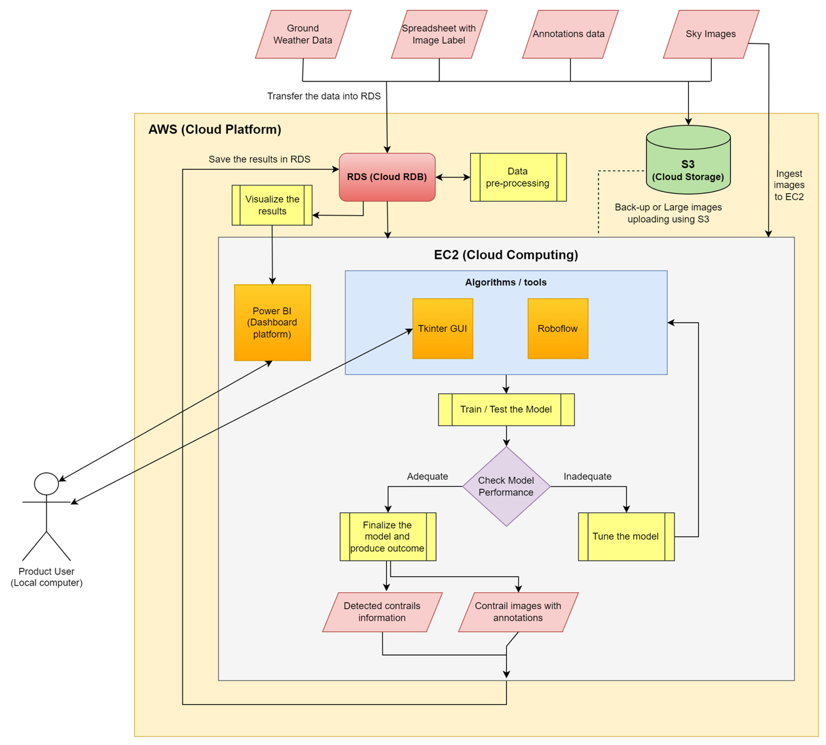
Our model requires high-performance computing to train the image detection model. We decided to use a combination of EC2 and S3 for our storage mediums. All of the data is stored in an S3 bucket as a back-up. The sky images, image labels, and ground weather data are then transfered into RDS, where they undergo pre-processing and then are sent back to RDS.
The sky images are then ingested into the storage in EC2. The model is trained and tested using Roboflow, Momentum AI, or Poly-YOLO in Ec2. After the model trains and tests, the performance of each algorithm is checked. If performance is satisfactory, the model is used to produce results. Otherwise, it is re-tuned and the process repeats.
The well-trained model’s results are saved to RDS, and organized and displayed in a Power BI report. The project also includes a Python GUI for users to run and view predictions using the model in EC2.
Model Training and Selection
VoTT Annotations
For the model to accurately detect contrails, we annotated every image that consisted of a contrail in two different ways. The two data labels used are the same for both types of annotations: ‘LongLived’ annotates long-lived contrails, and ‘Cirrus’ annotates cirrus contrails.
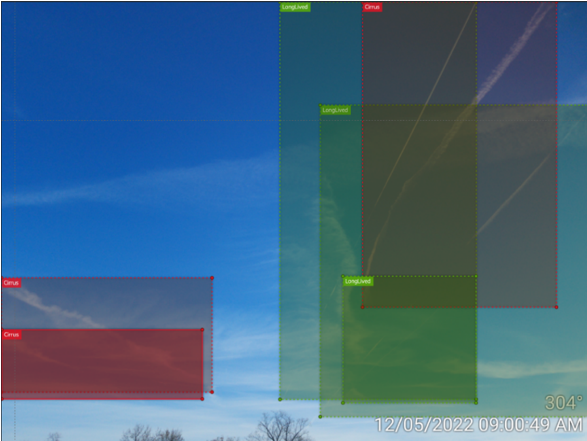
The first way we annotated the images was by using rectangular annotations. We chose this because most computer vision models are only able to accept rectangular annotations. However, rectangular annotations are not as accurate as polygon annotations.
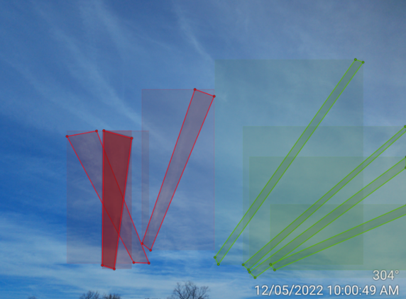
The main advantage of polygon annotations is that the machine learning model can detect contrails with more accuracy as these are custom annotations. Polygon annotations are advantageous when there is no definite or rigid structure of the object that we are trying to predict. This will give us more room to fine tune the model and detect hidden structures present in the clouds.
Roboflow
Roboflow is a computer vision development framework that makes creating a deep-learning computer vision model easy in a low-code/no-code environment. The interface simplifies uploading images, annotating images, pre-processing the data, and training and deploying models. Roboflow uses the YOLO algorithm to train computer vision models. For this project, we chose to create two types of models: an object detection model and a multi-label classification model.
The multi-label classification model identifies whether each type of contrail is present in the image but does not identify where the contrails are or draw bounding boxes around the contrails. It also does not identify whether there are multiple contrails in the image. However, the accuracy of this algorithm tends to be much higher because there is less detail required.
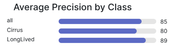
Both the object detection and multi-label classification models have benefits, however the object detection model performed well and is able to locate the contrails in the images, so this was the model we decided to use. The final object detection model that performed the best was trained from a checkpoint. It has auto-orienting, resizing, and auto-adjusting contrast as the preprocessing steps. We also found that augmenting the exposure improved accuracy while also making the model more robust. The model has a mean average precision of 81.5%, precision of 92.2%, and recall of 66.5%. As shown in below, the precision is best for long-lived contrails. It makes sense that the model does not perform as well with cirrus contrails, as they are less defined shapes.
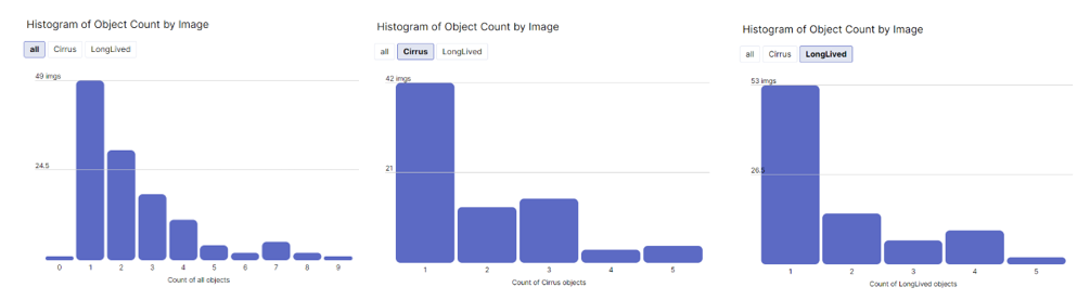
The roboflow user interface creates several visuals automatically to help users understand the data. Below are histograms depicting the number of contrails detected in each image. The leftmost histogram is the count of both types of contrails. The middle histogram is only cirrus contrails, and the rightmost figure shows only long-lived contrails. It is clear from these figures that most images only have one contrail present, no matter what type. An image with more than three contrails is especially uncommon.
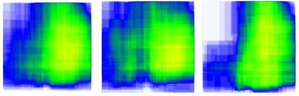
The other type of visualization Roboflow automatically creates is a heatmap depicting the location of the object annotations. The leftmost heatmap depicts all contrails, the middle heatmap depicts cirrus contrails, and the rightmost heatmap depicts long-lived contrails. Based on these figures, cirrus contrails are more spread out than long-lived contrails. The contrails tend to be concentrated towards the right side of the images, so with more information the exact location where the contrails are most likely to form could be triangulated.
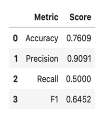
Logistic Regression Model
After developing the object detection model, we used the model outcomes and combined the outcomes with the weather dataset. The main objective of this is to find out which weather phenomenon is influencing contrail formation the most. The reason for choosing logistic regression model was because it had the highest accuracy out of Logistic Regression, Random Forest and XGB Classifier model with an accuracy of 76% and precision of 91%. We found out that contrails are easily detected when the visibility is high, and this feature is extremely important to detect contrails.
Shown below are the performance metrics for the model, which performed exceptionally well with precision but had a low recall.
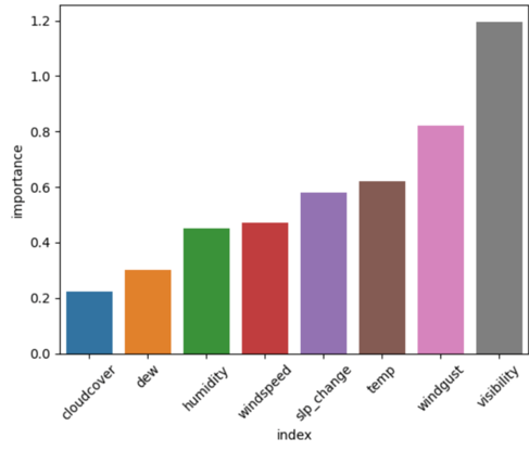
We also evaluated the variable importance based on the coefficients of the logistic regression model. Visibility, wind gust speed, and temperature were the most important variables for this model.
Click Here to see the code for our Logistic Regression model.
LR = LogisticRegression()
LR.fit(X_train_scaled, y_train)
LR_pred = LR.predict(X_test_scaled)

Acc_LR = round(accuracy_score(LR_pred, y_test), 4)
xgprec_LR, xgrec_LR, xgf_LR, support_LR = score(y_test, LR_pred)
precision_LR, recall_LR, f1_LR = round(xgprec_LR[0], 4), round(xgrec_LR[0],4), round(xgf_LR[0],4)
scores_DT = pd.DataFrame({
    'Metric': ['Accuracy', 'Precision', 'Recall', 'F1'],
    'Score': [Acc_LR, precision_LR, recall_LR, f1_LR]})
scores_DT
Statistical Testing
We chose to perform two hypothesis tests, t-test and Wilcoxon rank-sum test, on a dataset with and without contrails to investigate the effect of the weather variables on contrail formation.
The data was pre-processed using the MinMaxScaler function of the SciKit Learn library to normalize the two types of data (with and without contrails).
Click Here to see a code snippet for this normalization.
X_train, X_test, y_train, y_test = train_test_split(features,label, test_size = 0.25, random_state = 0, stratify=label)
sc=MinMaxScaler()
X_train_scaled=pd.DataFrame(sc.fit_transform(X_train))
X_test_scaled=pd.DataFrame(sc.transform(X_test))
The results of the t-test used to obtain the p-values of each variable are shown below.
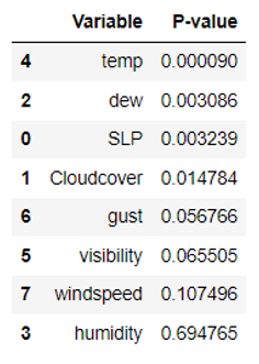
As indicated in the above table, the variables that showed significant differences between the two datasets at a significance level of 0.05 or less were temperature, dew point, change in sea level pressure, and cloud cover. Thus, the null hypothesis was rejected for these variables, and it was concluded that the presence of contrails is affected by the variables.
Click Here to see a code snippet for the t-test.
SLP_stat = stats.ttest_1samp(a = false_df.SLP, popmean = true_df.SLP.mean() )
Cloudcover_stat = stats.ttest_1samp(a = false_df.Cloudcover, popmean = true_df.Cloudcover.mean() )
Dew_stat = stats.ttest_1samp(a = false_df.Dew, popmean = true_df.Dew.mean() )
Humid_stat = stats.ttest_1samp(a = false_df.Humid, popmean = true_df.Humid.mean() ) # not significant
Temp_stat = stats.ttest_1samp(a = false_df.Temp, popmean = true_df.Temp.mean() )
Vis_stat = stats.ttest_1samp(a = false_df.Vis, popmean = true_df.Vis.mean() ) # not significant
Gust_stat = stats.ttest_1samp(a = false_df.Gust, popmean = true_df.Gust.mean() ) # not significant
Windspeed_stat = stats.ttest_1samp(a = false_df.Windspeed, popmean = true_df.Windspeed.mean() ) # not significant

  p_vals = pd.DataFrame({
    'Variable': ['SLP', 'Cloudcover','dew','humidity','temp','visibility','gust','windspeed'],
    'P-value': [SLP_stat.pvalue, Cloudcover_stat.pvalue, Dew_stat.pvalue, Humid_stat.pvalue,
              Temp_stat.pvalue, Vis_stat.pvalue,Gust_stat.pvalue, Windspeed_stat.pvalue]})
p_vals.sort_values('P-value')
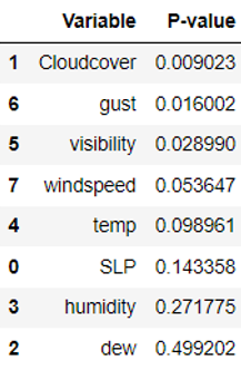
To validate the results obtained from the t-test, we also performed the Wilcoxon rank-sum test, which does not assume any specific distribution of the data and is therefore nonparametric. Since normalization was not required for this test, the data were directly used for the analysis. The p-values obtained from the Wilcoxon rank-sum test are presented below.
Click Here to see a code snippet for the Wilcoxon rank-sum test.
SLP_stat = stats.ranksums(x = false_df.SLP, y = true_df.SLP)
Cloudcover_stat = stats.ranksums(x = false_df.Cloudcover, y = true_df.Cloudcover )
Dew_stat = stats.ranksums(x = false_df.Dew, y = true_df.Dew)
Humid_stat = stats.ranksums(x = false_df.Humid, y = true_df.Humid)
Temp_stat = stats.ranksums(x = false_df.Temp, y = true_df.Temp)
Vis_stat = stats.ranksums(x = false_df.Vis, y = true_df.Vis)
Gust_stat = stats.ranksums(x = false_df.Gust, y = true_df.Gust)
Windspeed_stat = stats.ranksums(x = false_df.Windspeed, y = true_df.Windspeed)

p_vals = pd.DataFrame({
    'Variable': ['SLP', 'Cloudcover','dew','humidity','temp','visibility','gust','windspeed'],
    'P-value': [SLP_stat.pvalue, Cloudcover_stat.pvalue, Dew_stat.pvalue, Humid_stat.pvalue,
              Temp_stat.pvalue, Vis_stat.pvalue,Gust_stat.pvalue, Windspeed_stat.pvalue]})
p_vals.sort_values('P-value')
Based on the results in the table, the variables that showed significant differences between the two datasets at a significance level of 0.05 or less were cloud cover, wind gust speed, and visibility. In summary, the only variable that showed significant differences between the two datasets at a significance level of 0.05 or less in both t-test and Wilcoxon rank-sum test was cloud cover.
Dashboard Development
An interactive, user-friendly dashboard was created in Power BI using the data from the image classification model and local ground weather data. This dashboard connects directly to our cloud database and its data can be refreshed by the user.
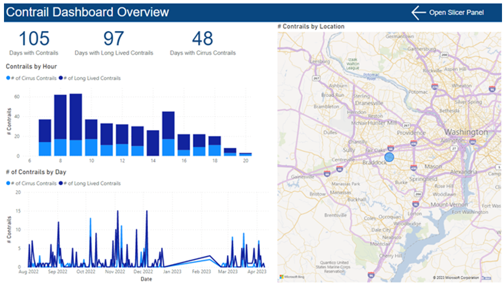
There are several pages to the dashboard. The first is an overview page (below), which can be filtered by types of contrails present, hour of the day, location, and more. It shows statistics and graphics involving the number of contrails over time, for each hour of the day, and by location.
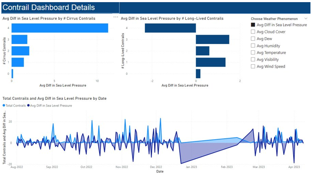
The next page is a detail page where the user can filter the page by weather phenomenon, including cloud coverage, precipitation, humidity, and more. The visuals show how the number of contrails change with the weather phenomenon.
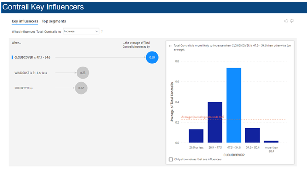
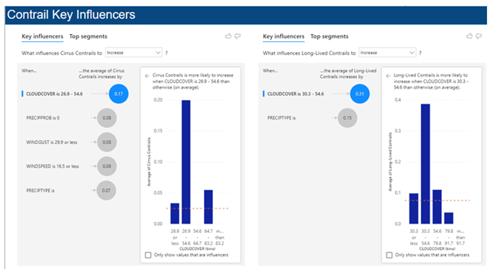
Finally, the last two pages show a key influencers visual for total contrails, as well as each individual type of contrail. The key influencers visual shows which variables have the most correlation with the number of contrails. It gives a measure for how correlated each important variable is to the number of contrails.
Findings
This project was focused primarily on the two deliverables (the GUI and the dashboard), so the focus was not on the key findings. However, throughout the project the team did make several discoveries.
- Most images only had 1-2 contrails at a time, and usually concentrated towards the right side of the image.
- Contrails are more likely to form in the morning, with the number of contrails diminishing throughout the day.
- Contrails are more common in the winter.
- The number of contrails tends to be higher 2 days after a drop in average sea level pressure.
- Cloud cover could be highly correlated with contrail formation, hoever there are some key questions surrounding this since cloud cover makes contrails harder to detect.
- High wind speeds could indicate a higher likelihood of contrail formation.
The final model was able to identify contrails with a mean average precision of 81.5%, a precision of 92.2%, and a recall of 66.5%.