Click here to see the interactive map if you are on a computer
Synopsis
This project is a continuation of a previous project I worked on for a class involving visualization. I chose to update the existing visualization I had already created that I was not completely happy with using Tableau, and created a Tableau Public page online.
This project includes:
- Importing and cleansing a large dataset in Tableau
- Creating calculated fields and LOD expressions
- Creating a map showing multiple variables
- Creating a custom legend
- Creating an interactive dashboard
The Datasets
The dataset used for this project comes from the USDA Research Data Archive. It contains information about 1.88 million wildfires that occurred in the United States from 1992 to 2018. It is a conglomeration of data from several different fire organizations at federal, state, and local levels. This dataset contains specifics about the location, size, date, causes, and other information for every wildfire in the United States. I also incoporated a dataset including the land area of counties in the US.
Specifically, this project focused on the variables involving the location, duration, size, and number of wildfires for each county.
Data Citation: Short, Karen C. 2021. Spatial wildfire occurrence data for the United States, 1992-2018 [FPA_FOD_20210617]. 5th Edition. Fort Collins, CO: Forest Service Research Data Archive. https://doi.org/10.2737/RDS-2013-0009.5
The Visualization
Click here to see the interactive map if you are on a computer
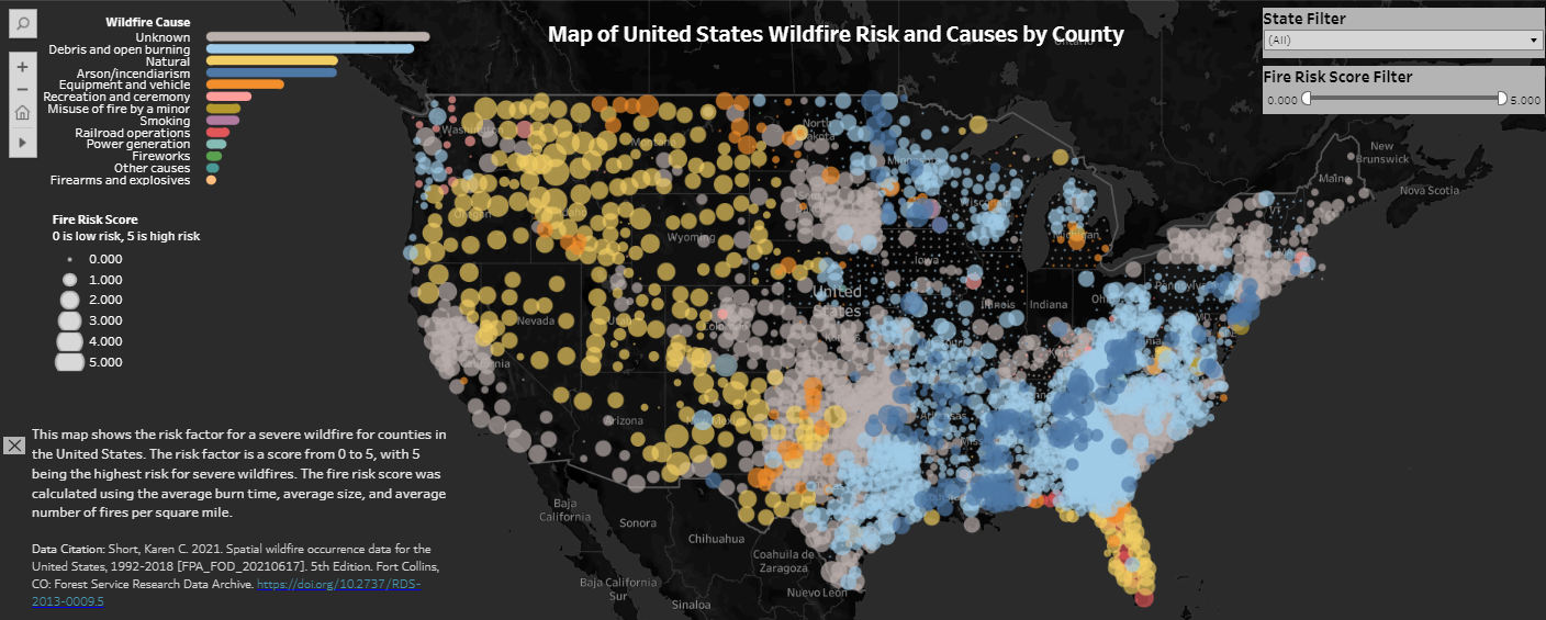
The map does not work for mobile devices. A screenshot of the map is included below.
The Process
To start this project, I had to do some data exploration and subject area research to decide how to create a score for fire risk. After some research, I learned that the risk of a severe wildfire for a given area is based on the average duration a wildfire burns, the average size of wildfires, and the average number of wildfires each year.
This dataset was already very clean, and was not missing any values in the columns that I used. The main cleaning I had to involved the names of certain counties. Some counties did not have the word “county” at the end, and so my map was interpreting these counties as two separate counties. I was able to fix this using the FIPS codes for counties.
I had to create calculated variables for each of these: average burn duration, average fire size, average number of wildfires per year. Average burn duration and fire size were simply averages of variables already included in the dataset. The average number of wildfires was a bit more complicated to calculate, as I had to incorporate the land area of the county into this calculation. This is why I incorporated a dataset involving FIPS codes by county and the associated land area.
For each of the calculated variables, I assigned a score from 0-5 based on the distribution of the data. I then averaged these 3 scores to get my final fire risk score for each county.
Once the calculated variables were finished, it was fairly simple to create the map. I decided to use circles for each county and colors for the main cause of wildfires for that county. I decided for the cause of wildfires that I wanted to show the most common causes country-wide as well. So instead of the default legend, I created a bar chart using the same color scheme as the map. This way the bar chart acts as both the legend and a way to add more information to the visualization.
I edited the tooltips to include the county and state name, fire risk score, and main cause of wildfires. I added filters by state and by fire risk score, to make it easier for users to find their own area or see where in the US is at most risk for severe wildfires.
After some minor cosmetic alterations, the map was complete. Future alterations will hopefully include fixing the legend for circle size so that the circles are not cut off. This is a visualization I plan to continually update.